As a designer who working on Web3 and crypto products, as a habit I always been reviewing the websites and apps. recently I've surfing on XDC website and I just realized an experience issue which I like to address.
1- Problem
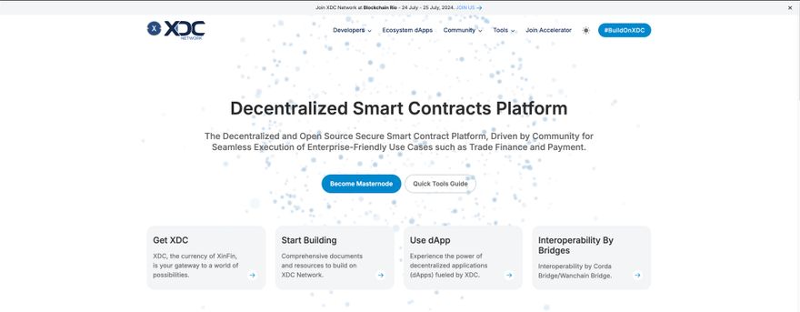
I will walk you through my experience. So first i was at here: https://xinfin.org
clicked on "Become Masternode" button which took me to this page:
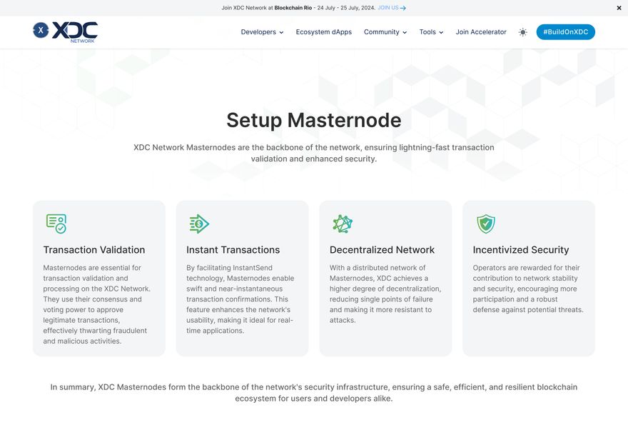
https://xinfin.org/setup-masternode
On this page there is no clear CTA on the feature page, leaving users unsure of the next steps to take.
2-Solution
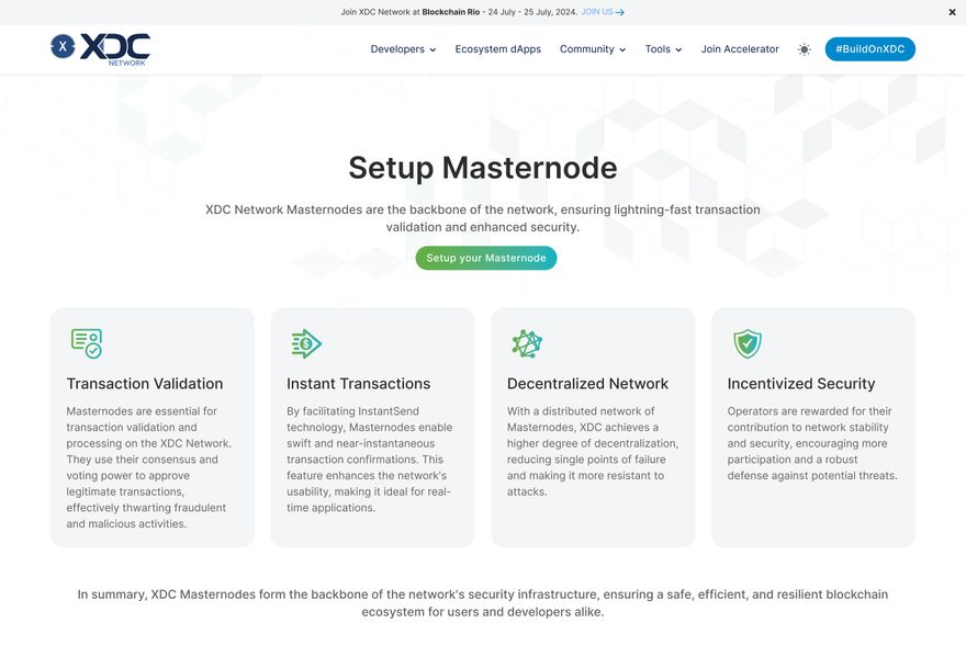
CTAs guide users on the next steps to take, reducing friction and making it easier for them to engage with content.
Solution: Adding Primary CTA: Add a prominent, clearly visible CTA on the feature page.
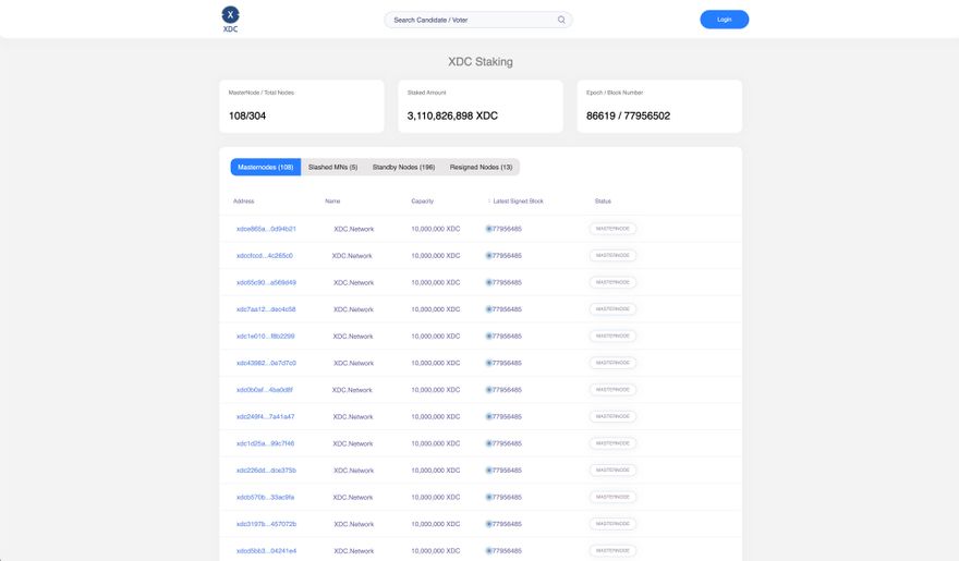
which take user to next page which is the Masternode setup page:
3-Expected Outcomes
- Increased Engagement:
Higher Interaction: A clear CTA is expected to increase user interactions with the new feature.
Improved Metrics: Trackable improvements in metrics such as click-through rates and time spent on the feature page.
- Higher Conversion Rates:
User Activation: More users are likely to start using the new feature, leading to higher activation rates.
Overall Conversions: An increase in the number of users converting from the landing page to active feature users.
So, it's not just a button, CTAs are most important elements which will guide user in expected flow.


Discussion (2)
Thank you Sadi for contibution, We have updated CTA as per your suggestions.
You're welcome, Perfect ✅